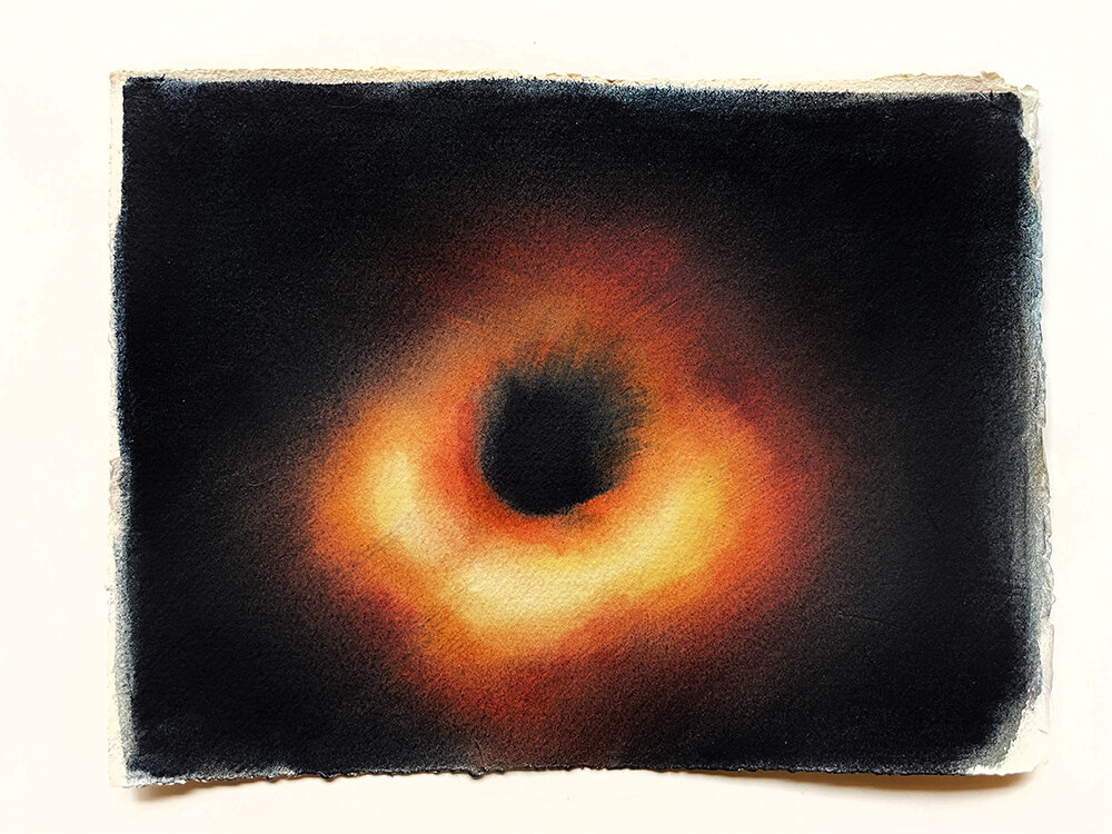
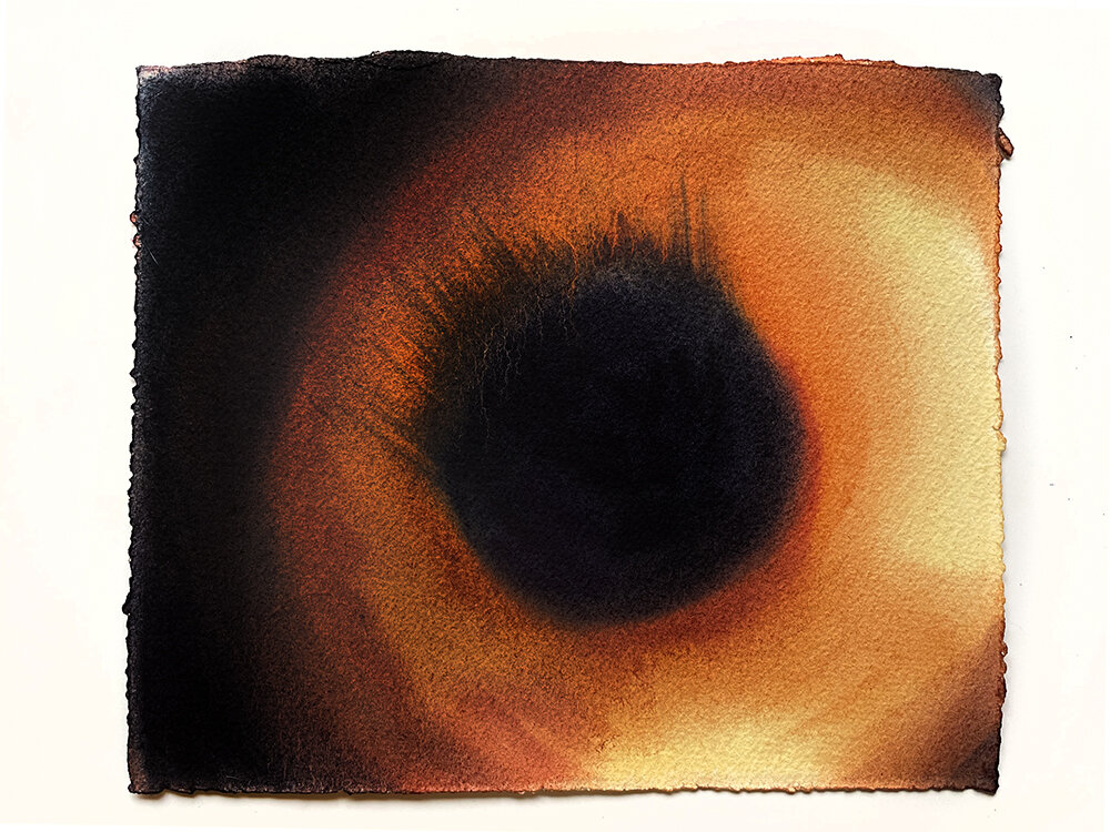
I was invited to create an image for the cover of a science magazine called Continuum, which is published in support of the Applied Superconductivity Conference. My model for the glossy cover was the famous Black Hole M87 for two reasons:
1. this black hole was the 1st one to be photographed, which of course made big news in 2019,
2. Art Lichtenburger was giving a lecture on the subject during the conference.
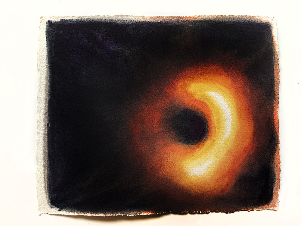
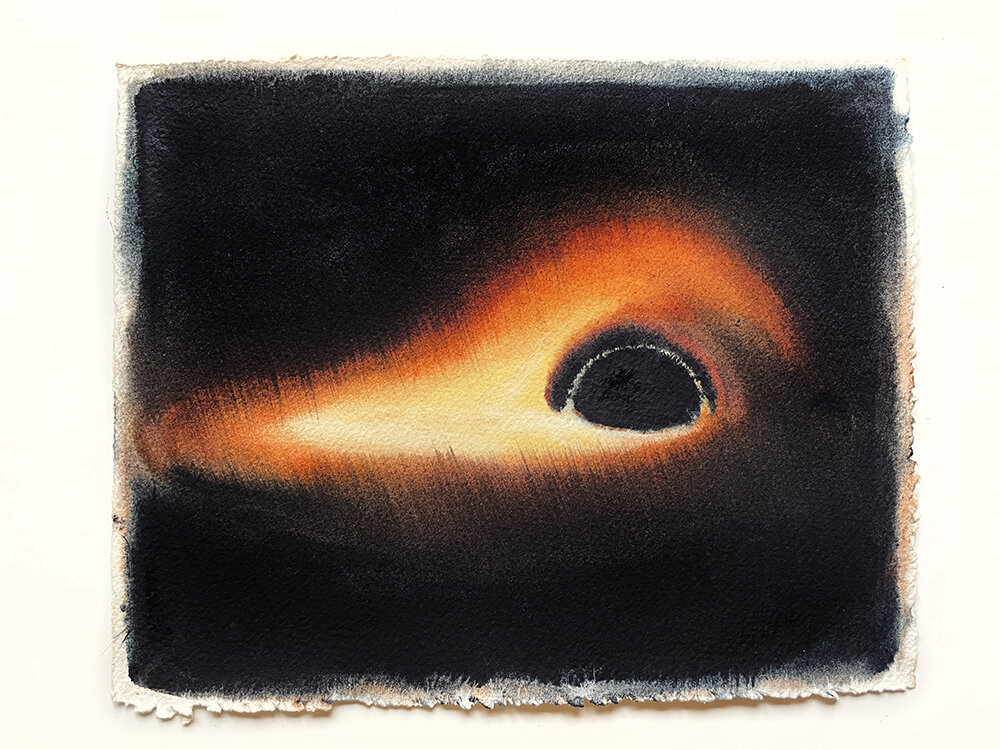
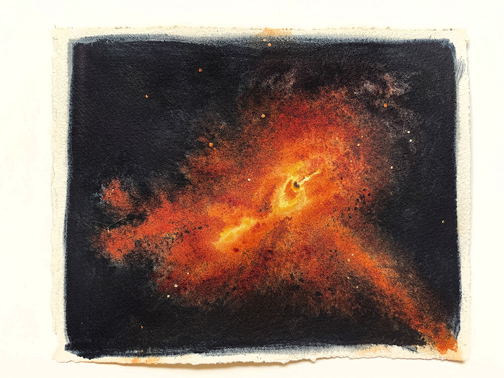
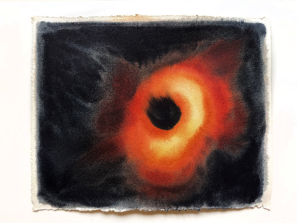
In order for me to make the design I went on researching black holes and what do we know about them. I chose to use my favorite media of watercolor to paint M87. I made a series of paintings exploring the possible views of the black hole, most all of them were based on the photograph by the Event Horizon Telescope that made the news.
I thought that just painting the photograph was not enough, so I brainstormed about how could I make this image more meaningful. Meanwhile, during my research, I was mesmerized by the fact that black holes are described not in a 3D format like most of the objects we know in our 3D world, but in 4D, having time as the 4th dimension.
Then I spent a very long time trying to add a visual graphic of the 4th dimension. My problem was that I could not find a definite answer on how this 4th dimension could be applied visually to the obvious 3D. I researched on my own, then I consulted with a couple of scientists, I even made a few drawings trying to visualize my options. In this drawing you see 4 options, where the red ball represents a black hole, and the funnel would be the time. If you know the answer to this question please leave a comment.
So this idea fell apart as I was not able to come up with the answer how could I add the time to the image of the black hole M87. From the photograph of M87 it seems to me that the swirl is almost facing you, almost as if you are looking inside of the funnel directly, so would the time be also deforming following the funnel shape almost precisely to the “visual” funnel?
You see, when working with black holes one must become a philosopher and a dreamer, so I was trying to become both, to get a little closer to the reality of an ordinary black hole.
Due to the presence of the 4th dimension, all sorts of other phenomenal things were offered to my view. One of them totally captivated my attention: because black holes distort space and time – they present an extraordinary visual phenomenon where light is optically deformed. For example, objects that are present behind a black hole are projected in front of it! Another interesting thing is that the image ends up being flipped. I would like to demonstrate this on an example of my pen and a glass ball: you can see the tip of the pen on the bottom right of the ball, even though the pen is positioned behind the ball on the left.
Design 1
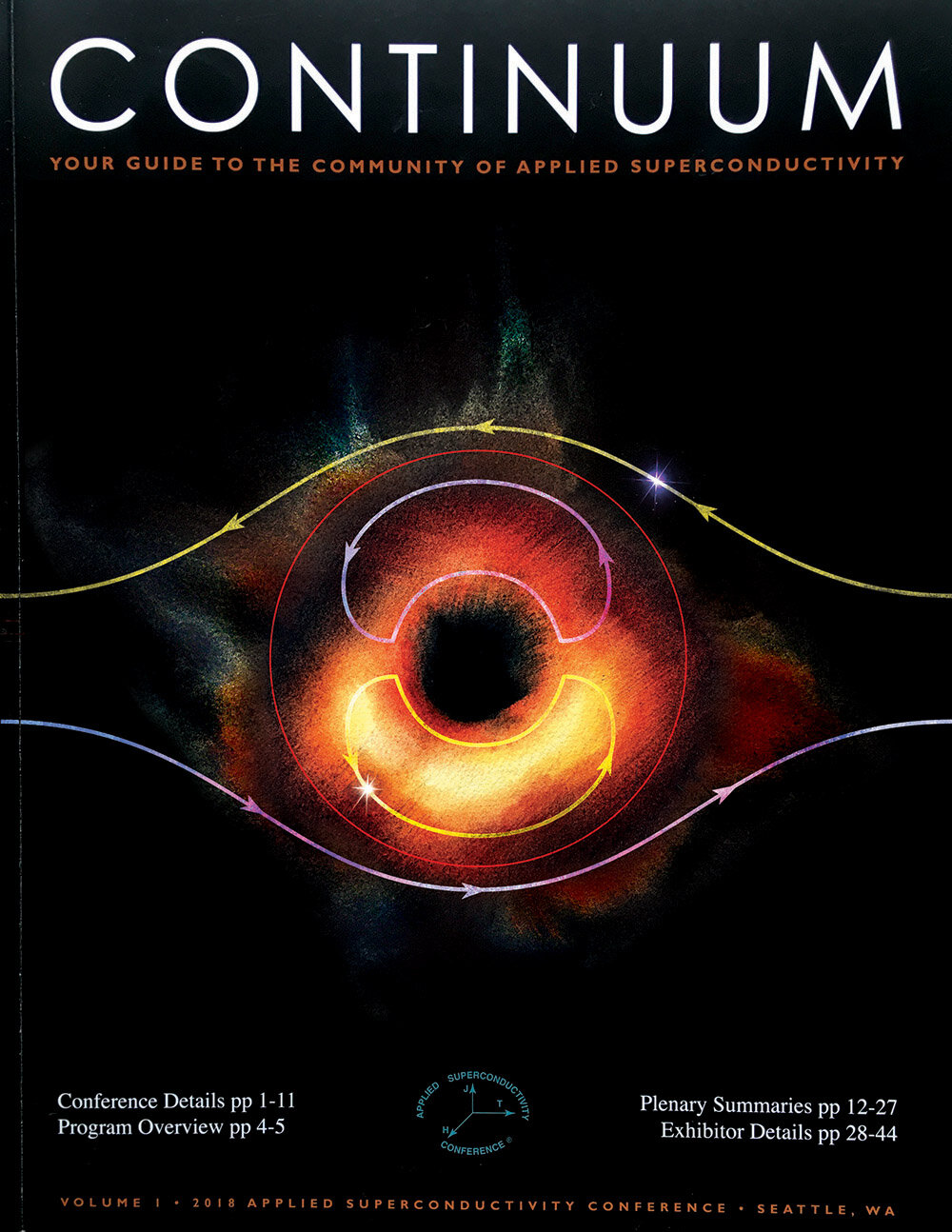
While doing research about that I came upon an article where Oliver James presented a graphic with an explanation “The distortion of space-time around a black hole is extreme and affects the structure of nearby light cones.” I made my 1st design of the cover. You can see a star following the yellow path on the top right, it is being projected in the inner yellow path diagonally. This suggests that the objects behind the black hole are projected in the foreground of the black hole. An absolute visual phenomenon.
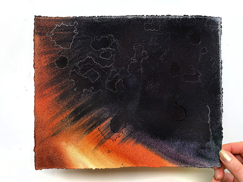
My second design was based on different interesting information, based on the article Infinite Visions Were Hiding in the First Black Hole Image’s Rings "When you point a telescope at a black hole, it turns out you don’t just see the swirling sizzling doughnut of doom formed by matter falling in. You can also see the whole universe. Light from an infinite array of distant stars and galaxies can wrap around the black hole like ribbons around a maypole, again and again before coming back to your eye, or your telescope." On my graphic you see the cosmic light coming from different directions, in the plane framed with a white border you see the swirly projection of the light that fell in earlier, as well as the other black hole matter.
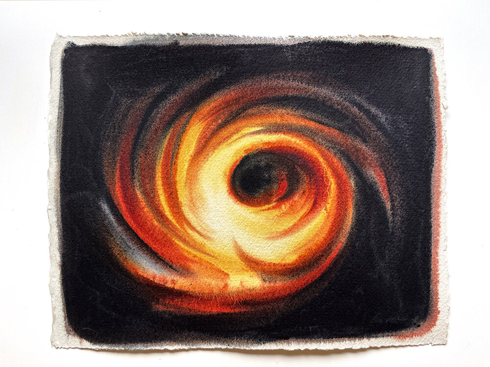
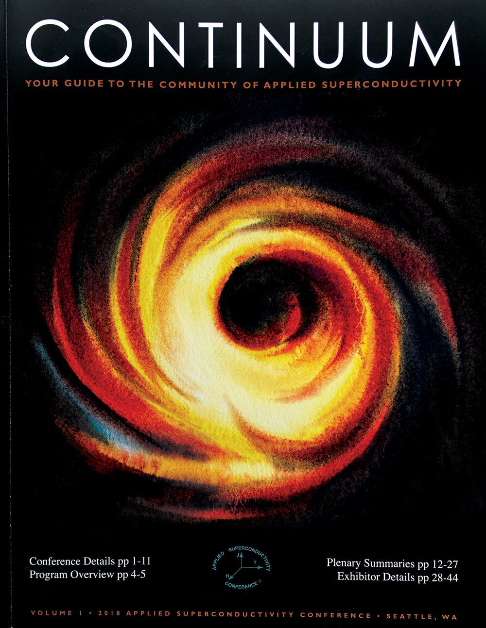
For my final third design option, I just chose one of my paintings as it is, the most dynamic of them all. The swirls of light and other matter. The doughnut image of M87 that we know is a collection of swirl images, an overlap, taken during an extended period of time. This design perhaps was the most simple but yet to me it is the most striking and graphicly attractive.
Design 2
Design 3
Even though I know what design was chosen for the magazine cover, I would love to hear your vote.
Leave a comment, which one would you pick for the cover? 1, 2 or 3?
